Thursday, May 27, 2010

Lab 7: Mapping the Station Fire in ArcGIS

On August 26, 2009, a massive fire broke out in Angeles National Forest, located in the northeastern portion of Los Angeles. The fire was christened the “Station Fire” due to its proximity to Mount Wilson, on top of which sits a station with 20 radio and television transmission towers. Firefighters were not able to completely contain the blaze until October 16, nearly two months later. The fire burned a total of 160,577 acres, making it the 10th largest in California state history. Unlike many other fires in Southern California, which are mostly grassland fires, the Station Fire was a true forest fire, as it burned primarily in the wooded hills of the Angeles National Forest. Still, the flames threatened homes in neighborhoods like La Canada Flintridge and Glendale, which border the forest to the south. 10,000 homes were evacuated as a precaution. In total, 64 structures were destroyed by the fire, and two firefighters were killed.

The first map is more a reference map than anything. I indicated the extents of the station fire on September 1st, the day with the largest area of fire coverage. It is layered on top of a map of Los Angeles with the census blocks designated. To spice it up a little bit, I also put the shaded block on a color scale indicating each blocs population density per square mile. The more red the bloc, the more people live in it. This allows someone looking at the map to immediately assess the where the areas of high concern are, purely in terms of the amount of people. Hopefully, the map allows viewers to see the extents of the fire in reference to the greater Los Angeles region. Sometimes, when you hear about something on the news it doesn’t actually hit home until you see how close you really were to the event. Someone living in the San Fernando Valley, for example, could see where their home is and then measure how close they were to the fire extents using the scale at the bottom and the map.

The Second map is a thematic map in that it looks at the same fire extents in the context of its proximity to children. The census blocs are shaded on a graded scale indicative of their population of children ages 5-17. To make the map easier to read, I put on a five mile buffer around the extents and then made it transparent so you could still see the census blocs. With this buffer you can see where the high concentrations of children that would be in danger are and respond accordingly for evacuations. As you can see on the map, the five mile radius includes the eastern portion of San Fernando, but more notably a fairly large residential population in Altadena. Using this map you can see where the largest risk areas for children are.

It’s important to examine where the largest populations of children are in relation to the fire, because all children are our future clichés aside, they are at a greater risk for smoke inhalation health issues. A New Jersey study showed that children represented a disproportionate percentage of people injured by smoke and fire. Children 11 and under comprised about ten percent of the population, but 22% of all fire related fatalities. With this in mind, it makes sense that neighborhoods with a high proportion of children plan for what to do in case of a fire—especially for those neighborhoods that are in close proximity to past fires. This would imply that the northern neighborhoods in Altadena and the eastern neighborhoods in San Fernando prepare accordingly for future fires as they lay within the buffer of the station fire.

In hindsight, high gusts and hot temperatures from the Santa Ana winds, contributed to the quick-burning blaze. The cause for the blaze, however, is thought to have been arson. The fire grew in size to an uncontrollable level in part because of the amount of dead, oily vegetable material on the ground, left over from decades of fire-free conditions. Such matter was highly combustible and provided fuel to the fire as it engulfed trees and wildlife alike. Thus, containing small fires will only lead to more massive, dangerous fires in the end. The Station Fire underscores the need for a reevaluation of California’s fire policy. Otherwise, only more fires will break out, and possibly even jump the line into the densely census tracts that you can see in the first map or worse yet to the neighborhoods with large child populations mentioned before.

California Department of Fire Protection.
http://cdfdata.fire.ca.gov/incidents/incidents_details_info?incident_id=377 (27 May 2010).

County of Los Angeles. "Station Fire Information."
http://www.lasdblog.org/Pressrelease/PR_Folder/SFUpdateTH-00.pdf.

InciWeb: Incident Information System.
http://www.inciweb.org/incident/1856/ (27 May 2010).

Lafferty, Kieth. "Smoke Inhilation." Web MD.
http://emedicine.medscape.com/article/771194-overview (27 May 2010).

Marciano, Rob. "'Angry fire' roars across 100,000 California acres." CNN.
http://www.cnn.com/2009/US/08/31/california.wildfires/index.html.


Thursday, May 20, 2010

Lab 6: DEM's in ArcGIS

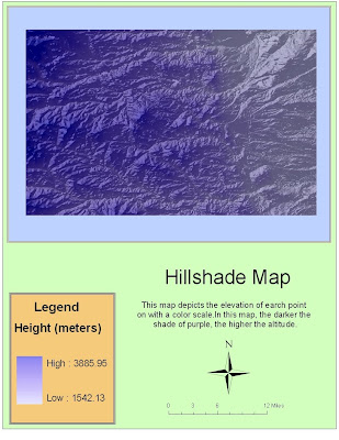
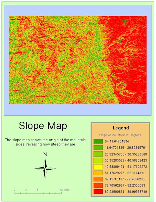
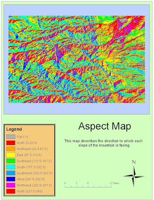
I chose a region in the Rockies of Colorado. This particular area is just to the West of Denver. There is a relative flatland on the eastern side of my region where the outskirts of the city are located. However, there is a pretty distinct north/south line where the higher elevations of the mountains become more evident. This is actually a region that I have been to and skied at so it was interesting seeing the area from this perspective. The geographic coordinate system used is the North American Datum S 1983.

The extents of the area of interest are:
Top 40.0427777773 degrees
Left -105.62861111 degrees
Right -105.113333332 degrees
Bottom 39.7141666661 degrees


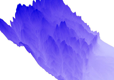
This last map is the 3D rendering of my area of interest. Hypothetically, it should give a three dimensional representation of the region I have been looking at for the last three maps.

Friday, May 14, 2010

Lab 5: Projections

The idea of map projections is a method for putting the sphere into two dimensional space. No matter how you do it these maps will be distorted. Generally, there are only really three ways to do try to do this. Your maps are either conformal, equidistant, or equal area. Conformal maps include projections like the Mercator or the North Pole Stereographic. They are intended to preserve angular relationships which is great in some situations (like navigation) and not as good in others. Equidistant projections like the Sinusoidal and the Plate Carree featured above intend to preserve distances between the origin and everything else on the map. Finally, equal area projections are meant to preserve the sizes of geographic features.

Conformal maps like the Mercator are probably the most common kind of map that you see in everyday life. It is used in classrooms, for reference, and for exploration. Its great because its relatively easy to make and read. However, it does distort the area closer to the poles. That’s why you see places like Greenland seeming so much larger than they really are. As a kid I thought Alaska was bigger than Mexico as a result of this distortion. Equidistant maps have a lot of positive features as well. For example, it’s the kind of map that you would want to use if you were measuring distance between points like Washington D.C. and Kabul for example. However, this only holds true if the points are of similar latitude in the Sinusoidal. If the straight line between the points is more diagonal then this kind of projection is more of a problem and you might want to use something like the Plate Carree which preserves distance along all latitudes. Equal Area maps like the Goode’s Homolosine projection is the best for maintaining the correct area of land masses. This way Greenland isn’t any bigger than it should be. However, it isn’t as good for comparing land features because it’s hard to represent the whole world as a rectangle.

Knowing the benefits and pitfalls of each of the types of projections, it becomes clear that there is no clear correct choice for maps. It is best to just choose your projection based on the circumstances and what your trying to convey. Nothing is going to preserve the correct comparative distance, shape, or area. Below are examples of each type of projection:


Conformal Maps

1: Mercator Projection: 10,112 miles
2: North Pole Stereographic Projection: 7,617 miles

Equidistant Mapping Projections

3: Sinusoidal: 8,098 miles
4: Plate Carree: 10,109 miles

Equal Area Maps

5: Lambert Azimuthal Equal Area: 6,806 miles
6: Goode’s Homolosine (Land): 9,986 miles

Thursday, May 6, 2010

Lab 4: Introducing ArcMap


I actually really enjoyed finally getting to use the ArcGIS software. We are going to start getting into the programs that we will be using for the majority of the GIS minor. I’m excited to get started and for that reason, going through that tutorial wasn’t as bad as I thought it was going to be. It seems like the possibilities are pretty incredible with ArcGIS as you are just able to do so much. That being said it really is another language so I was thankful for the well illustrated and easy to follow directions on the tutorial. The pictures highlighting exactly what to do made it easy for me to do the steps without getting stuck. It’s not exactly a aesthetically pleasing interface, but I suppose this isn’t really what’s important to ESRI. Function over form as the saying goes.

In the tutorial I created a printable page with four data frames on it: three maps and one chart. They were all related to a possible airport expansion. With the program, I was able to manipulate given data and shape files into a visually pleasant presentation of specific aspects related to the project. I thought it was particularly cool when I did the population density map and I was able, through the symbology tab, assign different colors to different levels of population density and spatially represent the data formerly only in table form. The program clearly has superior computing and graphing capabilities that other mapping software like say google maps just doesn’t have. I also think the tutorial made an effort to show all the wide array of different things you can do with ArcMap. While I don’t really know about other GIS software it seems like ArcMap is extremely versatile.

However being so versatile has its setbacks as well. The more capabilities a program has, the more confusing it’s going to be to learn. This unavoidable truth makes ArcMap’s depth both a blessing and a curse. I can tell this isn’t the kind of program that you can be an expert at after a few little tutorials. It takes hard work and lots and lots of practice to master software like this. To most working to learn the program will seem difficult and almost tedious. This is ok with me though because the less fun the program the more valued having the skill set will be.

I guess another setback for ArcGIS is that it has little potential for large scale public use. The combination of not being web 2.0 associated and the fact that it’s incredibly expensive makes it difficult for anyone outside a university or a company to recreationally use it. The bottom line is that this is essentially professional software that will always be complicated and difficult to use if you don’t know how. It will never be able to compete with up and coming web 2.0 phenomenon like google maps because to the average person it seems boring and difficult. This being said it’s an amazing group of software that I look forward to gaining expertise in and using it towards my career path.