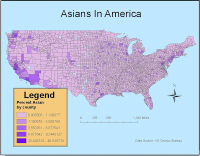


In the map examining the spatial distribution of Asian Americans in the United States, we see that the largest concentrations are in the Cities and areas surrounding San Francisco, Seattle, and New York. In general, the map shows that there are more Asians along the west coast than anywhere else in the country. This makes sense when you consider the geographical origins of Asian immigrants. In the late nineteenth and early twentieth century when a majority of immigration from Asia was going on they came over in large boats from the east looking for opportunity in America. It is also interesting that you see, in general, a larger proportion of Asians in urban areas. For example there are a bunch of cities where there is Asians surrounding it, but there are large concentrations in it like Chicago, Houston, and Dallas.
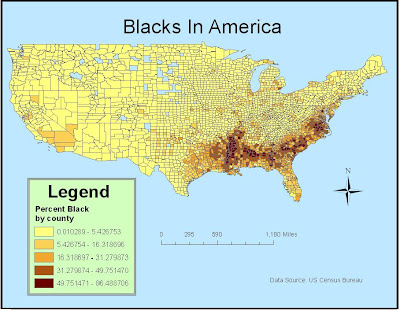
The map depicting the spatial distribution of Blacks in United States is much different from the map of Asian one. The concentrations of blacks in the far south, especially along the Mississippi River can be attributed to the history of slavery. The South was very invested in the slave trade from Africa which brought millions of black slaves over to work on the labor intensive plantations and farms in the south. We didn’t see this kind of involvement in the slave trade with the north because of a combination of moral and economic conflicts. Northern states were much more industrialized and urbanized than the south and the need for large scale labor operations was unnecessary. Even though the horrible history of slavery eventually did end, this didn’t affect where they were located and the large majority of blacks remained in the south after they were freed.
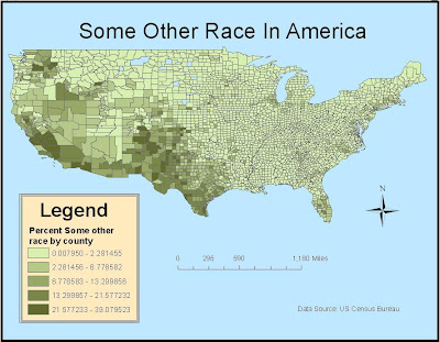
The map concerning the concentrations of other races in America is different from both of the other two maps. This category aggregates all people whose responses did not fall into the categories of “”White”, “Black or African American”, “American Indian and Alaska Native”, “Asian” and “Native Hawaiian and Other Pacific Islander”. This includes people who are half of a certain ethnicity like Asian, Mexican, Latino, Puerto Rican, Cuban, or something else more exotic. However, about 97% of this group is of Mexican descent. This explains the spatial distribution on the map. The highest proportions are in the southwest and California which corresponds with where most Mexican immigrants go. This makes sense when you consider the fact that most of them are either walking or driving from Mexico which borders the Southwestern portion of the United States on the southern border. There are also darker shades in the Southern portion of Florida. This is most likely a reflection of the large Cuban populations in the area.
From these maps, we can see that history and geography play a large role in the spatial distribution of ethnicities in the United States. They certainly are not dispersed evenly throughout the country and there are complex and unique reasons for their specific distributions. These maps are good for getting a general idea for where ethnicities are concentrated right now, but there they could be better if they were compared with other thematic maps that gave a map of how their distributions have changed over time or perhaps a comparison of spatial distributions of races and educational attainment or poverty. Essentially, these maps don’t actually work towards a point—they are more informative than anything.
GIS offers a way of visualizing data that would otherwise just be abstract numbers. Maps provide an instant picture that help us understand the spatial components of information. GIS also helps us bring disparate data sets together. For instance, a political campaign team could combine the thematic maps displaying ethnicity in America, as shown above, with maps of the electoral college to see where they should target their efforts. As an example, President Obama likely spent more time in the South than other presidents, knowing that he would have a good chance of getting out the black vote. Bill Richardson, the Governor of New Mexico who himself is half-Mexican, probably would have hit the campaign trail heavily in the Southwest were he to have conducted a national campaign. GIS helps us to easily see the relationships between people and places. GIS has other applications, too, whether in economics or environmental science, in politics or in the arts. With the click of a few buttons, we can develop a better understanding of the connections between the elements – like fire and rainfall, or between business factors like foot traffic and advertising. Just one computer program allows us the power to visualize knowledge in the form of maps, yet we must be aware of its flaws and of the limits of maps in general. People often view maps as “the truth” without questioning their validity. GIS can offer information in an attractive format, but its reliability depends upon the accuracy of the data source, the skills of the GIS technician, and the abilities of the cartographer to bring the various elements of a map together.
No comments:
Post a Comment