Sunday, April 18, 2010
Lab 3: Neogeography
View Best Day Ever in a larger map
This is a map of what I like to imagine as the best day ever. I tried to make it relatively realistic in terms of how much I can accomplish and the feasibility of budget constraints, but it wouldn’t be the best day ever without a little extravagance right?
It doesn’t take too much brainpower to comprehend the usefulness of neogeography. It testifies to a time in history in which people are used to doing everything themselves. From personal computing, to social networking, to blogs we are indeed the do-it-yourself generation. Neogeography fits right into this mentality as it allows anyone, virtually anyone, to create maps for themselves or for others. It allows for unprecedented flexibility and individuality that map making used to lack. Being able to put additional information like pictures and videos into the map is helpful because you can enhance the message or desired ambiance of the map in ways that simple changes in colors and shapes can’t do. Being able to embed other websites into certain locations puts information at the tip of the viewers fingers if he/she so chooses to look.
However, there are a few pitfalls to neogeography as well. Purely based on my experience with Google My Maps there could be improvements in the existing software. I didn’t like how big each of the icons and their respective descriptions were. I feel like if there were any significant amount of icons the map would become cluttered and confusing. This is of course a rather petty complaint as far as pitfalls go. It is also possible that information shared on networks employing neogeography could be used in unintended ways. Although it is no complaint of the field or practice itself, it’s just important to be careful about what you make public because everyone can see and use the information for whatever intents and purposes they like. This includes criminals, sexual predators, stalkers and the like. This being said, as long as you are careful neogeography is incredibly helpful and has a bright future.
Wednesday, April 14, 2010
Lab 2
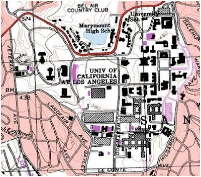
1. The quadrangle is called Beverly Hills
2. The adjasenct quadrangles are Hollywood, Burbank, Topanga, Van Nuys, Canoga Park, Venice, are Inglewood.
3. The quadrangle first created in 1966.
4. The North American Datum of 1927 was used to create this map.
5. The Scale is 1 : 24000
6. At the above scale, answer the following:
a) 5 centimeters on the map is equivalent to how many meters on the ground? A: 1200 meters.
b) 5 inches on the map is equivalent to how many miles on the ground? A: 1.89 miles
c) one mile on the ground is equivalent to how many inches on the map? A:. 2.64 inches
d) three kilometers on the ground is equivalent to how many centimeters on the map? 12.5 cm
7. What is the contour interval on your map? A: 20ft
8. What are the approximate geographic coordinates in both degrees/minutes/seconds and decimal degrees of:
a) the Public Affairs Building;
34.07403°, -118.43916°
34° 4′ 26.508″N, -118° 26′ 20.976″W
b) the tip of Santa Monica pier;
34.00748°, -118.49994°
34° 0′ 26.928″N, 118° 29′ 59.7834″W
c) the Upper Franklin Canyon Reservoir;
34.12046°, -118.41012°
34° 7′ 13.656″N, -118° 24′ 36.432″
9. What is the approximate elevation in both feet and meters of:
a) Greystone Mansion (in Greystone Park); 560 ft 170 meters
b) Woodlawn Cemetery; 140ft or 42.7 meters
c) Crestwood Hills Park; 620ft or 118 meters
10. What is the UTM zone of the map? 11.
11. What are the UTM coordinates for the lower left corner of your map?
UTM easting 3763000
UTM northing 362000
12. How many square meters are contained within each cell (square) of the UTM gridlines? 1,000,000 square meters.
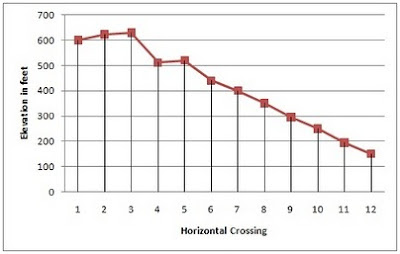
13. Obtain elevation measurements, from west to east along the UTM northing 3771000, where the eastings of the UTM grid intersect the northing. Create an elevation profile using these measurements in Excel (hint: create a line chart). Figure out how to label the elevation values to the two measurements on campus. Insert your elevation profile as a graphic in your blog.
14. The map has a 1999 magnetic declination north at the center of the map.
15. In which direction does water flow in the intermittent stream between the 405 freeway and Stone Canyon Reservoir? A: It flows North to South.
16.
2. The adjasenct quadrangles are Hollywood, Burbank, Topanga, Van Nuys, Canoga Park, Venice, are Inglewood.
3. The quadrangle first created in 1966.
4. The North American Datum of 1927 was used to create this map.
5. The Scale is 1 : 24000
6. At the above scale, answer the following:
a) 5 centimeters on the map is equivalent to how many meters on the ground? A: 1200 meters.
b) 5 inches on the map is equivalent to how many miles on the ground? A: 1.89 miles
c) one mile on the ground is equivalent to how many inches on the map? A:. 2.64 inches
d) three kilometers on the ground is equivalent to how many centimeters on the map? 12.5 cm
7. What is the contour interval on your map? A: 20ft
8. What are the approximate geographic coordinates in both degrees/minutes/seconds and decimal degrees of:
a) the Public Affairs Building;
34.07403°, -118.43916°
34° 4′ 26.508″N, -118° 26′ 20.976″W
b) the tip of Santa Monica pier;
34.00748°, -118.49994°
34° 0′ 26.928″N, 118° 29′ 59.7834″W
c) the Upper Franklin Canyon Reservoir;
34.12046°, -118.41012°
34° 7′ 13.656″N, -118° 24′ 36.432″
9. What is the approximate elevation in both feet and meters of:
a) Greystone Mansion (in Greystone Park); 560 ft 170 meters
b) Woodlawn Cemetery; 140ft or 42.7 meters
c) Crestwood Hills Park; 620ft or 118 meters
10. What is the UTM zone of the map? 11.
11. What are the UTM coordinates for the lower left corner of your map?
UTM easting 3763000
UTM northing 362000
12. How many square meters are contained within each cell (square) of the UTM gridlines? 1,000,000 square meters.
13. Obtain elevation measurements, from west to east along the UTM northing 3771000, where the eastings of the UTM grid intersect the northing. Create an elevation profile using these measurements in Excel (hint: create a line chart). Figure out how to label the elevation values to the two measurements on campus. Insert your elevation profile as a graphic in your blog.

14. The map has a 1999 magnetic declination north at the center of the map.
15. In which direction does water flow in the intermittent stream between the 405 freeway and Stone Canyon Reservoir? A: It flows North to South.
16.

Thursday, April 1, 2010
Lab 1: Three Maps
 This is a population density map of the United States that I obtained from the Census information in 2000. Whoever made this map assigned a shade of red to correspond with the population density of the county. The darker the shade of red, the more people that live in that particular county. I think maps like this are interesting for a couple reasons. Most importantly, it's definitely important to know where the people of this country primarily live. As is pretty obvious from the map, centers of population are highly skewed to the east with only pockets of densely populated regions in the west such as the Denver area, the Pacific Northwest, the San Francisco Bay area, and Southern California. This is important to keep in mind as centers of population often determine political, social, and cultural importance. In the context of this map you can see why so many national organizations, sports teams, and economic activities are located in the east.
 This is a map of the Chinese high speed rail network that I found in an article of the Transport Politic, which, as you might have guessed, is a transit oriented publication. The article, written by Yonah Freemark, tries to highlight the incredible public infrastructure investment China has been and is undergoing in the recent decade--particularly in high speed rail. As the map shows, the network isn't particularly impressive compared to other high speed rail power houses like France, Germany, or Spain in respects to their completed rail lines. However, when you consider all of the planned lines and the lines that are already under construction, China suddenly becomes a web of interconnected rail lines. You will soon be able to travel from Beijing in the north to Shanghai and even Hong Kong in the south all on efficient and cheap high speed rail lines. The map also shows the relative maximum speed of these lines by the width of the line on the map. In my opinion, this is an informative, well constructed map.
 This final map is taken from a weblog called the Map Room where they map the world’s economic activity on a one-degree grid. Animations for the entire globe are available, as are maps of individual countries. This particular map juxtaposes France's (on the left) spatial distribution of economic activity against Germany's (on the right). In areas of higher economic activity, the map appears to elevate and become more red. This is not a measure of population, although, as you can see, there is a fairly significant correlation between the two if you are familiar with where most of the two countries' populations are located. I think this map is really interesting because it highlights France's incredible economic reliance on Paris in relation to other parts of the country. This is in contrast to Germany's map which is relatively spread out in comparison. While the quality of these maps isn't particularly impressive, the information that they convey is definitely really interesting and it makes me want to know more about the reasons for such a difference in the two countries' spatial distribution of economic activity.
Subscribe to:
Comments (Atom)