
This is a population density map of the United States that I obtained from the Census information in 2000. Whoever made this map assigned a shade of red to correspond with the population density of the county. The darker the shade of red, the more people that live in that particular county. I think maps like this are interesting for a couple reasons. Most importantly, it's definitely important to know where the people of this country primarily live. As is pretty obvious from the map, centers of population are highly skewed to the east with only pockets of densely populated regions in the west such as the Denver area, the Pacific Northwest, the San Francisco Bay area, and Southern California. This is important to keep in mind as centers of population often determine political, social, and cultural importance. In the context of this map you can see why so many national organizations, sports teams, and economic activities are located in the east.

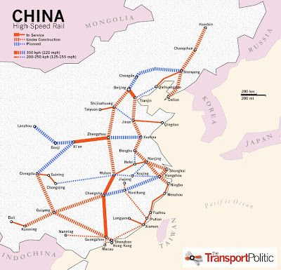
This is a map of the Chinese high speed rail network that I found in an article of the
Transport Politic, which, as you might have guessed, is a transit oriented publication. The article, written by Yonah Freemark, tries to highlight the incredible public infrastructure investment China has been and is undergoing in the recent decade--particularly in high speed rail. As the map shows, the network isn't particularly impressive compared to other high speed rail power houses like France, Germany, or Spain in respects to their completed rail lines. However, when you consider all of the planned lines and the lines that are already under construction, China suddenly becomes a web of interconnected rail lines. You will soon be able to travel from Beijing in the north to Shanghai and even Hong Kong in the south all on efficient and cheap high speed rail lines. The map also shows the relative maximum speed of these lines by the width of the line on the map. In my opinion, this is an informative, well constructed map.
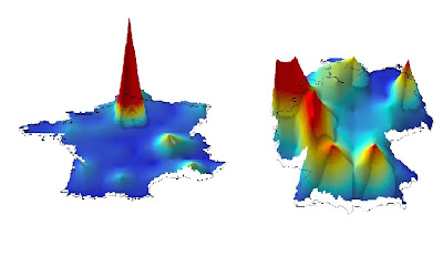
This final map is taken from a weblog called the Map Room where they map the world’s economic activity on a one-degree grid. Animations for the entire globe are available, as are maps of individual countries. This particular map juxtaposes France's (on the left) spatial distribution of economic activity against Germany's (on the right). In areas of higher economic activity, the map appears to elevate and become more red. This is not a measure of population, although, as you can see, there is a fairly significant correlation between the two if you are familiar with where most of the two countries' populations are located. I think this map is really interesting because it highlights France's incredible economic reliance on Paris in relation to other parts of the country. This is in contrast to Germany's map which is relatively spread out in comparison. While the quality of these maps isn't particularly impressive, the information that they convey is definitely really interesting and it makes me want to know more about the reasons for such a difference in the two countries' spatial distribution of economic activity.
 This is a population density map of the United States that I obtained from the Census information in 2000. Whoever made this map assigned a shade of red to correspond with the population density of the county. The darker the shade of red, the more people that live in that particular county. I think maps like this are interesting for a couple reasons. Most importantly, it's definitely important to know where the people of this country primarily live. As is pretty obvious from the map, centers of population are highly skewed to the east with only pockets of densely populated regions in the west such as the Denver area, the Pacific Northwest, the San Francisco Bay area, and Southern California. This is important to keep in mind as centers of population often determine political, social, and cultural importance. In the context of this map you can see why so many national organizations, sports teams, and economic activities are located in the east.
 This is a map of the Chinese high speed rail network that I found in an article of the Transport Politic, which, as you might have guessed, is a transit oriented publication. The article, written by Yonah Freemark, tries to highlight the incredible public infrastructure investment China has been and is undergoing in the recent decade--particularly in high speed rail. As the map shows, the network isn't particularly impressive compared to other high speed rail power houses like France, Germany, or Spain in respects to their completed rail lines. However, when you consider all of the planned lines and the lines that are already under construction, China suddenly becomes a web of interconnected rail lines. You will soon be able to travel from Beijing in the north to Shanghai and even Hong Kong in the south all on efficient and cheap high speed rail lines. The map also shows the relative maximum speed of these lines by the width of the line on the map. In my opinion, this is an informative, well constructed map.
 This final map is taken from a weblog called the Map Room where they map the world’s economic activity on a one-degree grid. Animations for the entire globe are available, as are maps of individual countries. This particular map juxtaposes France's (on the left) spatial distribution of economic activity against Germany's (on the right). In areas of higher economic activity, the map appears to elevate and become more red. This is not a measure of population, although, as you can see, there is a fairly significant correlation between the two if you are familiar with where most of the two countries' populations are located. I think this map is really interesting because it highlights France's incredible economic reliance on Paris in relation to other parts of the country. This is in contrast to Germany's map which is relatively spread out in comparison. While the quality of these maps isn't particularly impressive, the information that they convey is definitely really interesting and it makes me want to know more about the reasons for such a difference in the two countries' spatial distribution of economic activity.
Interesting maps and it's nice to see a variety of ways to display spatial information--shading, symbols and even 3D!
ReplyDelete10/10